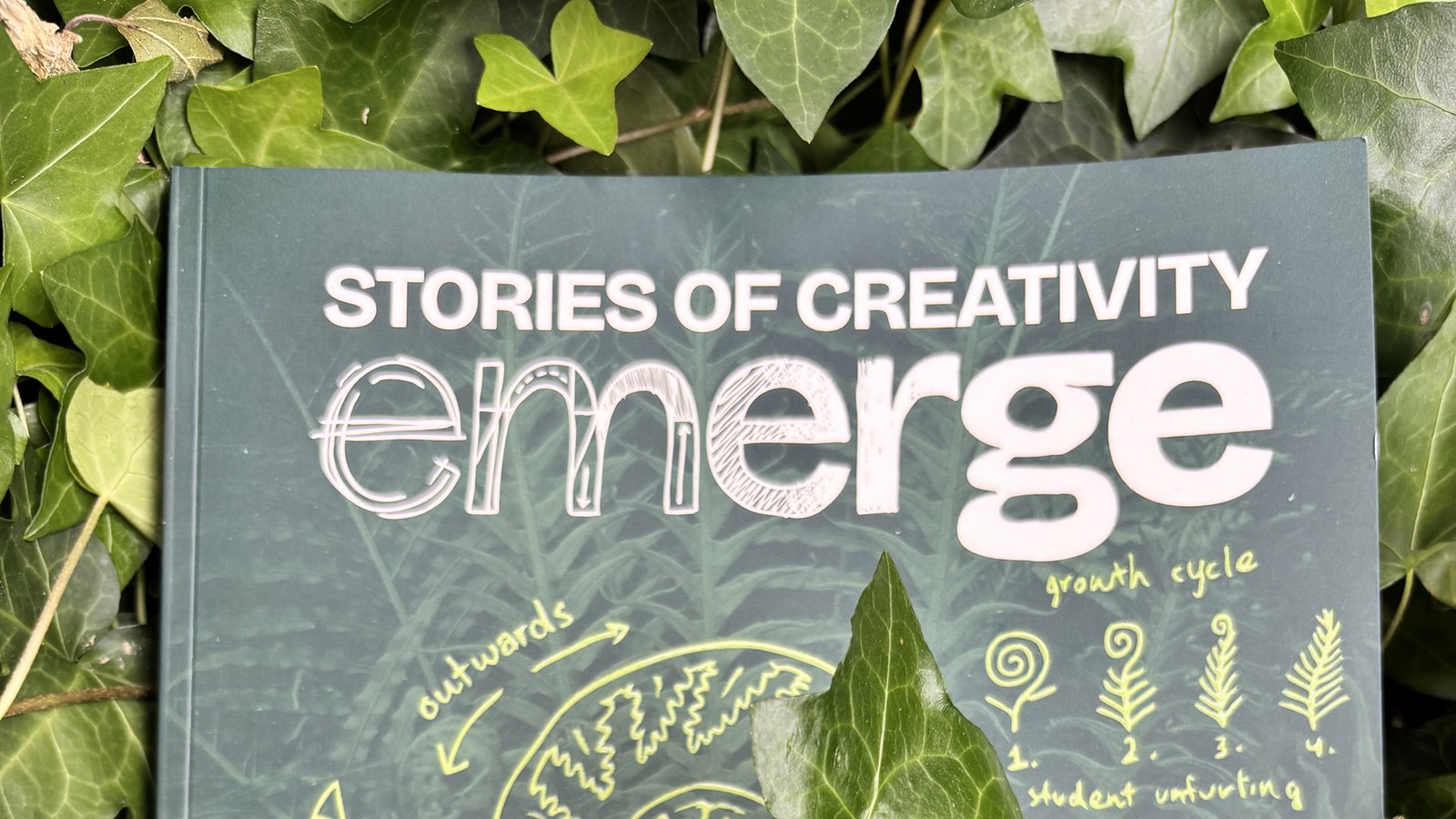

In 2025 I took a class in which we worked alongside university staff and other stakeholders to design and build Murdoch University’s annual creative showcase, an event that showcases the work of students in the Creative Media sphere at Murdoch.
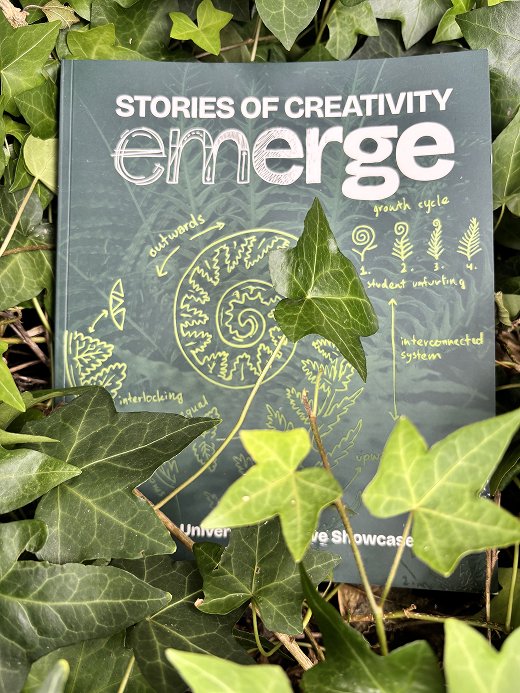
The 2025 showcase was titled Emerge: Stories of Creativity. Conceptualised by our class, the Emerge theme explores growth, connection and human stories, represented through imagery of plants, and visually inspired by the natural world and various botanical textbooks we collected as references.
Myself and two other students made up the publication team, and were tasked with designing and developing a printed publication to be given out at the event. The book includes all student work displayed at the showcase, along with a foreword, student interviews, and other content including colouring pages and flipbook animation!
How might we create an event that is accessible and follows the theme of Emerge, represents the experience at Murdoch University, and communicates the University’s values?
– Our problem statement
My Roles
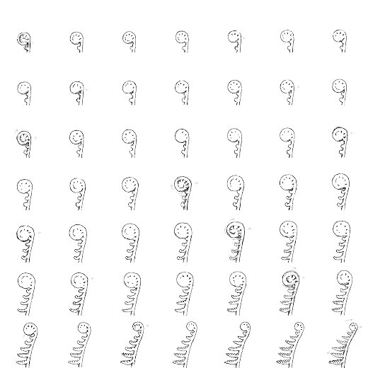
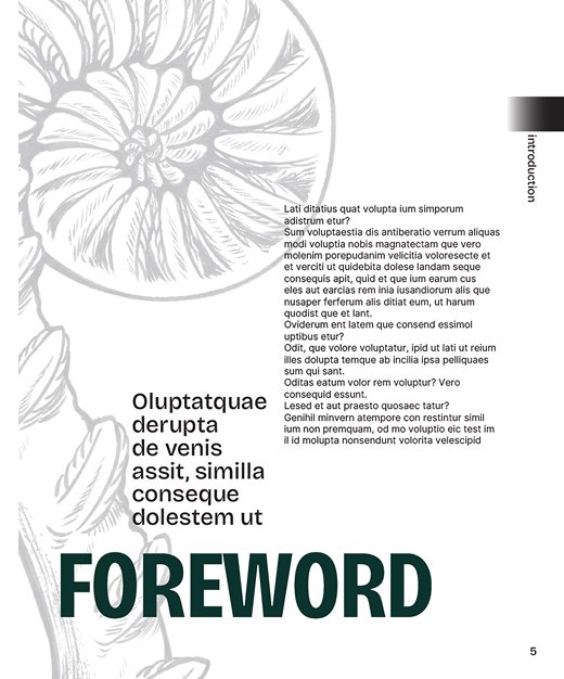
All three team members contributed to designing, prototyping and production, though each took primary responsibility for specific aspects of the project. My main contributions were creating a style guide and ensuring visual consistency across the document, designing a navigation system for readability and accessibility, and establishing the dimensions and grid system to be used as a guide when creating pages. I also made a simple flipbook animation that plays as the reader flicks through the book’s pages.
Navigation
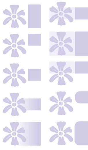
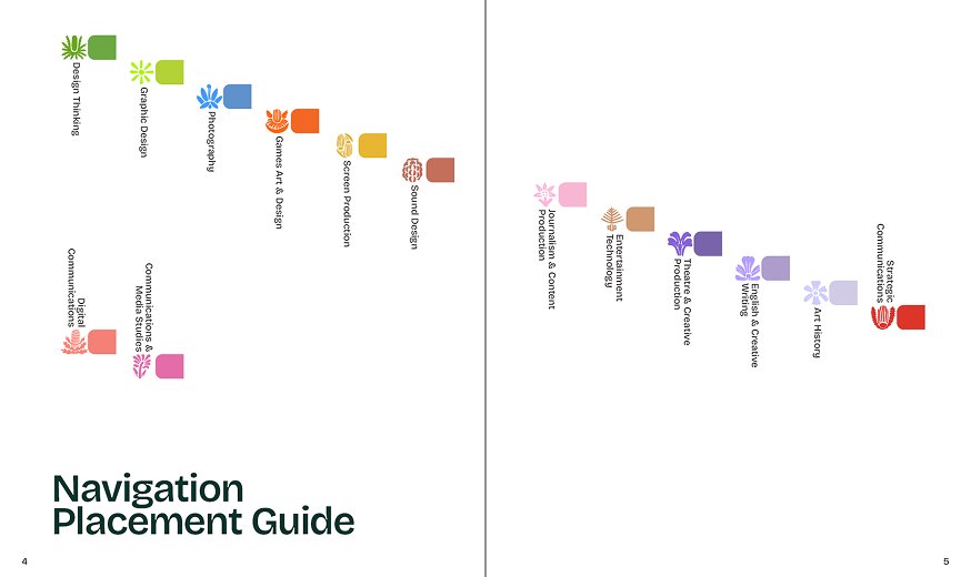
Accessibility was a major focus for us when designing the publication. I designed the navigation system with the goal of making it easy for readers to find sections within the publication, while not relying purely on colour, which could cause accessibility issues for colour blindness.
The system uses a set of navigation tabs on the outer edge of each page, each with a colour, symbol and position corresponding to a section of the book. The position of the tabs makes them visible along the edge of the pages, making it quick and easy to find a specific section. The tabs are staggered down the page, which makes each section easy to differentiate without relying on colour.
Animation
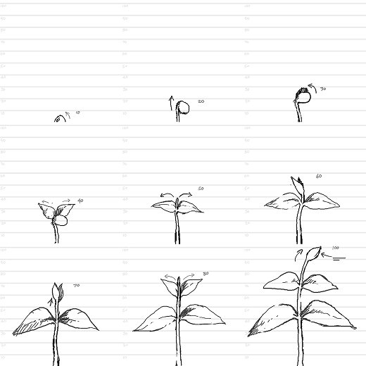
I proposed the flipbook animation as a way to enhance the reader’s interaction with the publication, and thus make reading it a more interactive and memorable user experience. It was also an opportunity for me to use some of my experience from illustration and game development to enhance the publication.