Tag: Publication

  • EMERGE: STORIES OF CREATIVITY

    EMERGE: STORIES OF CREATIVITY

    In 2025 I took a class in which we worked alongside university staff and other stakeholders to design and build Murdoch University’s annual creative showcase, an event that showcases the work of students in the Creative Media sphere at Murdoch. 

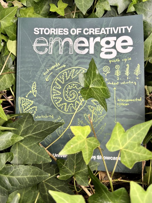
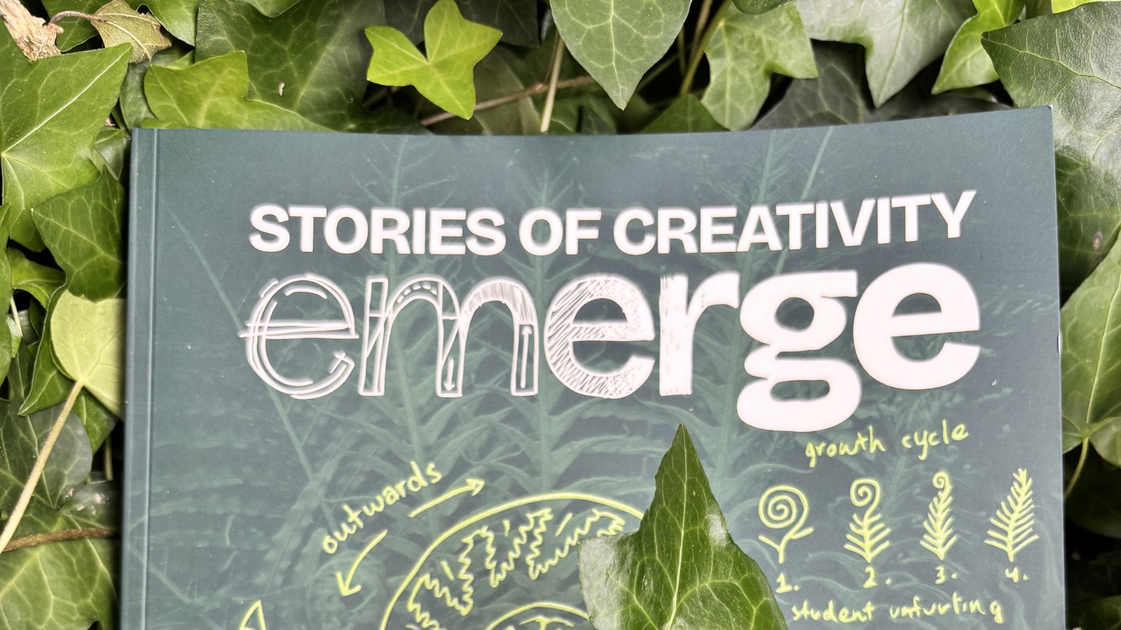
    The 2025 showcase was titled Emerge: Stories of Creativity. Conceptualised by our class, the Emerge theme explores growth, connection and human stories, represented through imagery of plants, and visually inspired by the natural world and various botanical textbooks we collected as references.

    Myself and two other students made up the publication team, and were tasked with designing and developing a printed publication to be given out at the event. The book includes all student work displayed at the showcase, along with a foreword, student interviews, and other content including colouring pages and flipbook animation!

    How might we create an event that is accessible and follows the theme of Emerge, represents the experience at Murdoch University, and communicates the University’s values?

    – Our problem statement

    My Roles

    All three team members contributed to designing, prototyping and production, though each took primary responsibility for specific aspects of the project. My main contributions were creating a style guide and ensuring visual consistency across the document, designing a navigation system for readability and accessibility, and establishing the dimensions and grid system to be used as a guide when creating pages. I also made a simple flipbook animation that plays as the reader flicks through the book’s pages.
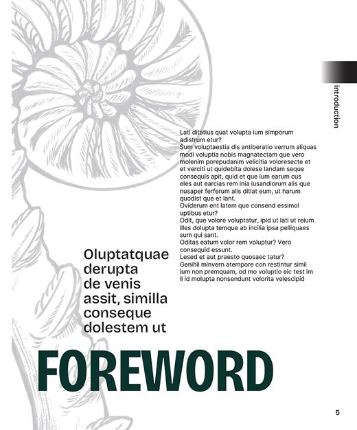
    A mockup of a foreword page, using placeholder text.
    An early mockup of how a page in the publication might look.
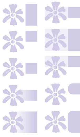
    10 variations of a lilac navigation tab featuring a stylised flower.
    Various navigation tab designs were tried before settling on one.

    Navigation

    Accessibility was a major focus for us when designing the publication. I designed the navigation system with the goal of making it easy for readers to find sections within the publication, while not relying purely on colour, which could cause accessibility issues for colour blindness.

    The system uses a set of navigation tabs on the outer edge of each page, each with a colour, symbol and position corresponding to a section of the book. The position of the tabs makes them visible along the edge of the pages, making it quick and easy to find a specific section. The tabs are staggered down the page, which makes each section easy to differentiate without relying on colour.
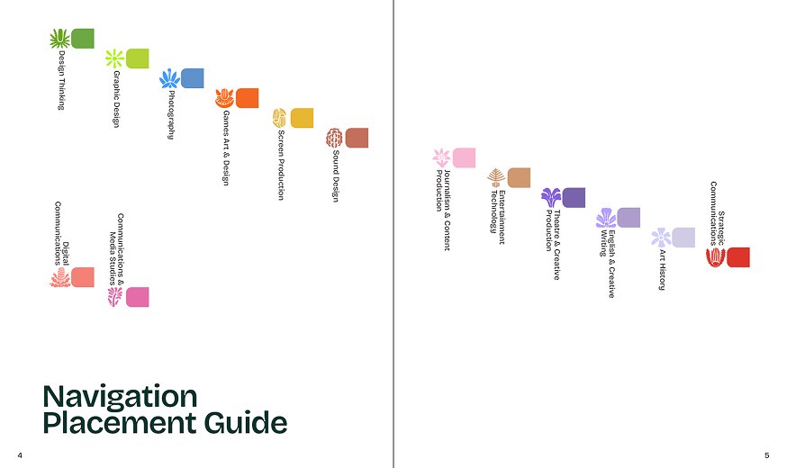
    Navigation placement guide (from the style guide).

    Animation

    I proposed the flipbook animation as a way to enhance the reader’s interaction with the publication, and thus make reading it a more interactive and memorable user experience. It was also an opportunity for me to use some of my experience from illustration and game development to enhance the publication.
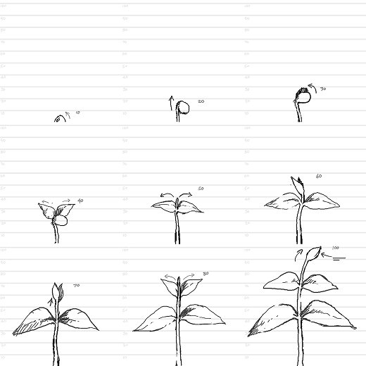
    9 frames of an animation of a plant sprouting.
    An earlier draft of the animation. It was changed to a fern to better match the event’s branding.
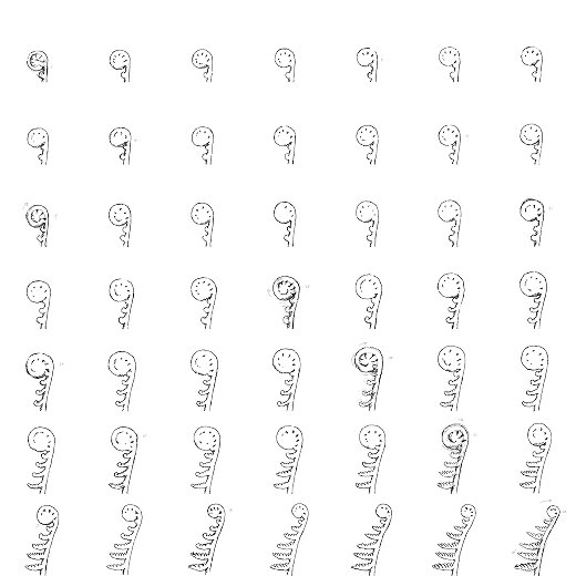
    49 frames of an animation of a fern unfurling.
    The final animation image sequence. The animation is made up of 49 frames in total.
    A photograph of the Emerge publication against a background of leaves.
  • PRINT IS NOT DEAD

    PRINT IS NOT DEAD

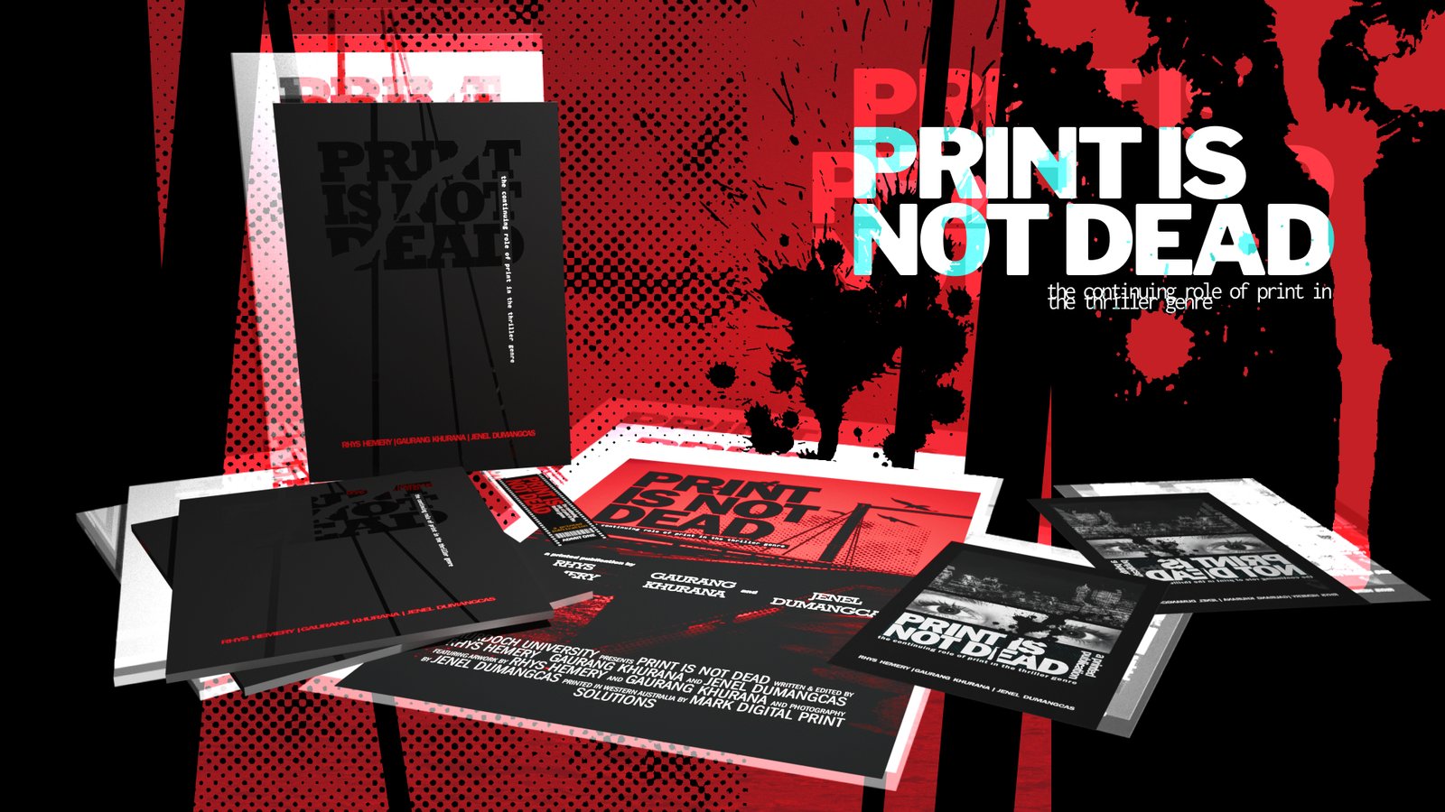
    Print is Not Dead: The Continuing Role of Print in the Thriller Genre is a publication that I worked on for a university assignment in 2025. The book explored the ways that graphic design and print are used in media to build suspense and thrill audiences.

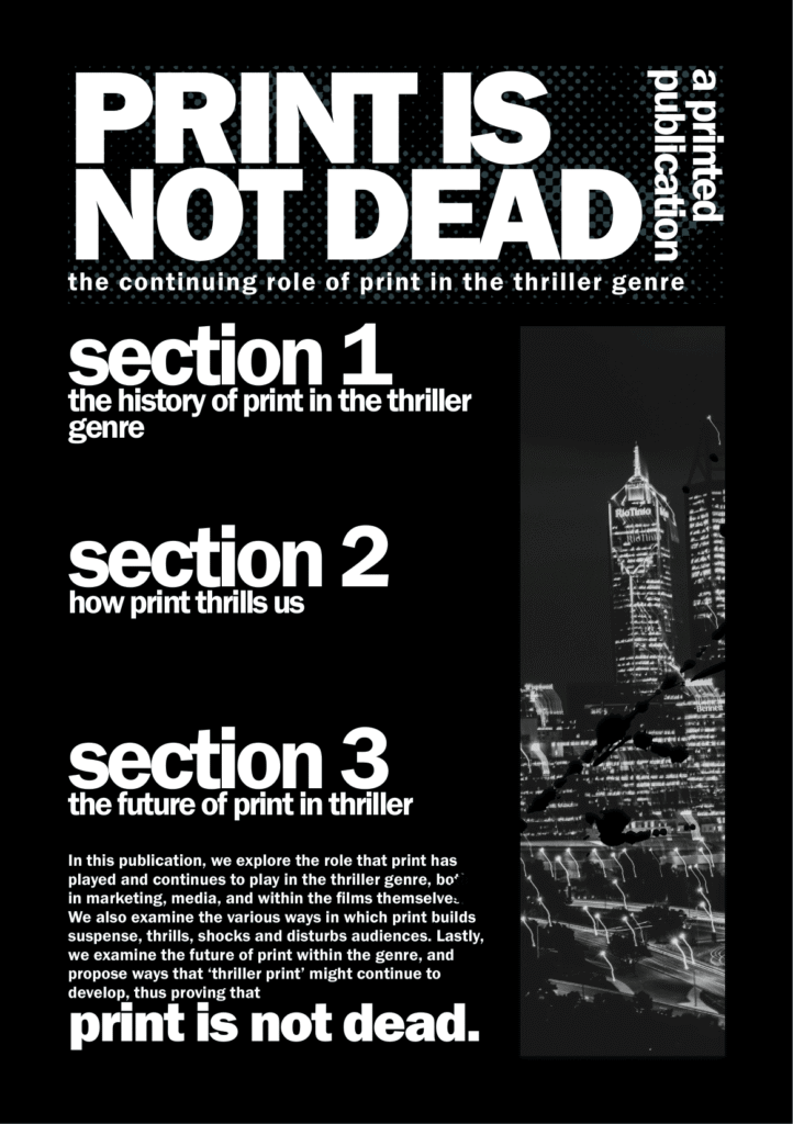
    The visual design was inspired by thriller, crime and horror film posters. I experimented with using colour, texture and typography in unconventional ways to instill discomfort in the viewer. This meant harsh colours and lighting, overlapping and distorted textures and compressed, blocky letters. It was a fun style to work with, particularly as a fan of horror, thriller and film posters.

    The full 40-page publication was a group project that I worked on with two other students, but the material shown here was created by me, incorporating photography by Jenel Dumangcas.

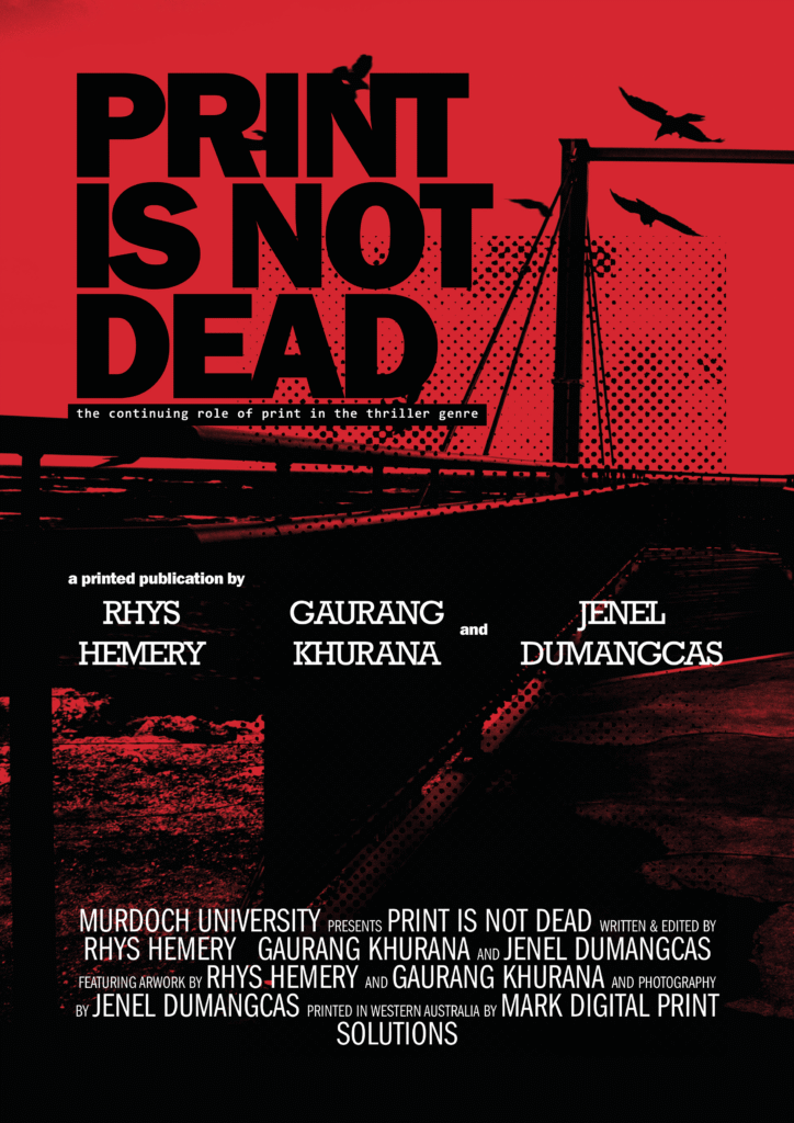
    A3 poster
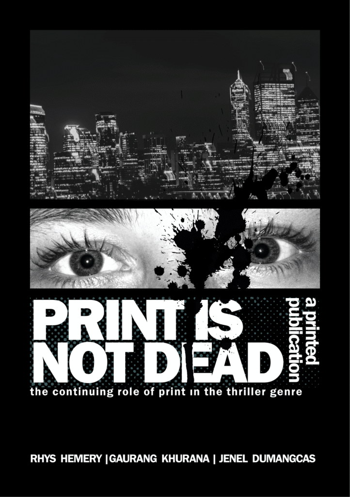
    A5 flyer (front)
    A5 flyer (back)
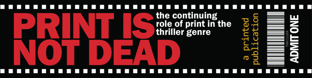
    Bookmark (front)
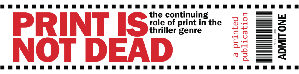
    Bookmark (back)

    I designed several print-ready promotional touchpoints for the project to go along with the full publication (shown above).

    The A3 poster is inspired by various film posters in the thriller and horror genres. Some notable inspirations include Silence of the Lambs (1991) , Dark Meridian (2017) and The Departed (2006). Our moodboards were filled with these posters, and I hope I managed to capture some of their unsettling energy in my designs. The poster and flyers feature lovely photography by Jenel, to which I applied heavy filtering to bring out areas of intense light and dark.

    I designed each for a different colour printing model to familiarise myself with the different workflows. The poster uses CMYK, the flyer is greyscale, and the bookmark uses Pantone colours.

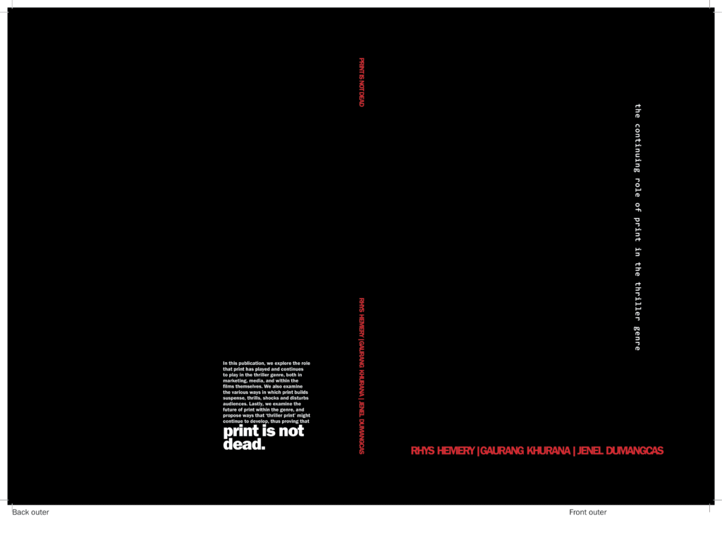
    Outer cover
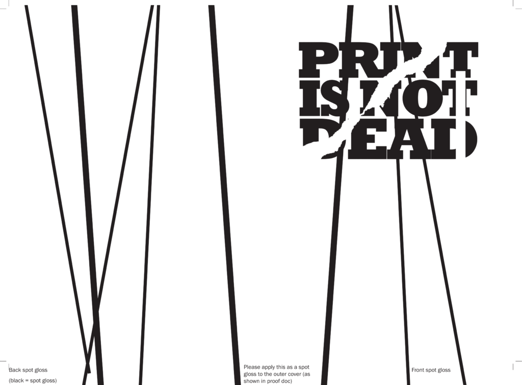
    Outer cover (spot gloss)
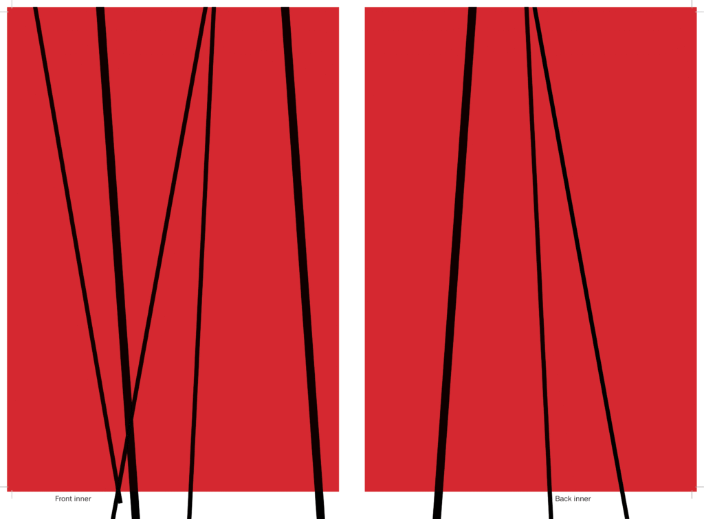
    Inner cover

    We had the idea of using a spot-gloss finish to make the publication’s cover a sort of secret message, only visible when the light reflects on it.

    The created the cover using three print files (shown above): a black outer cover and red inner cover to be printed on satin coated stock, and a spot UV layer to be printed over the outer cover as spot gloss. The end result is clean, sleek and surprisingly legible, despite the title being written in clear gloss coating.