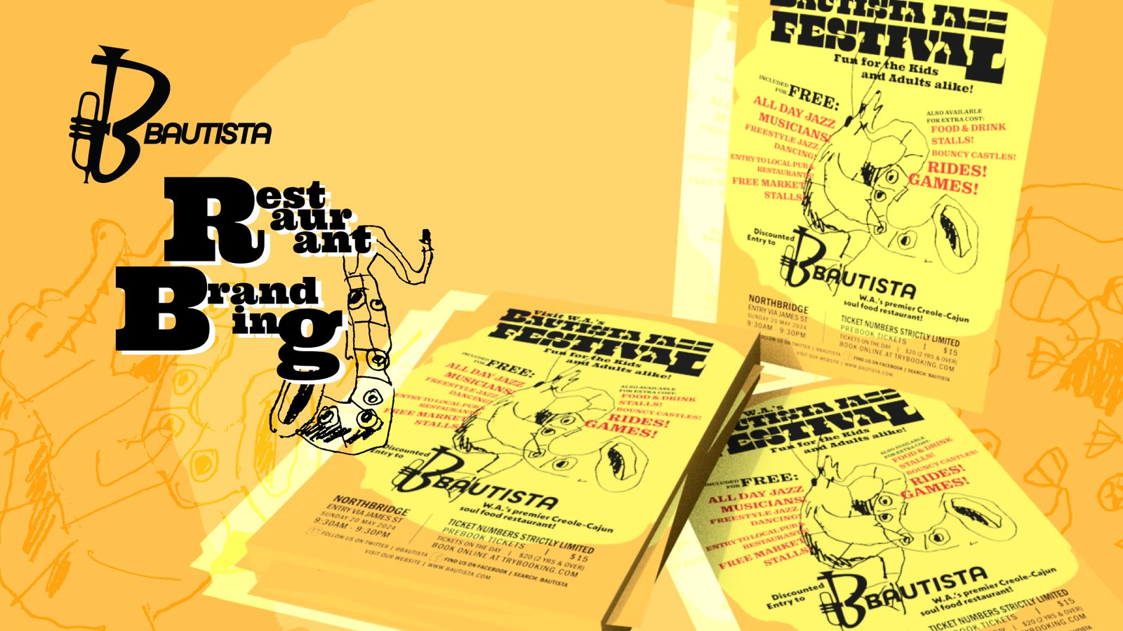
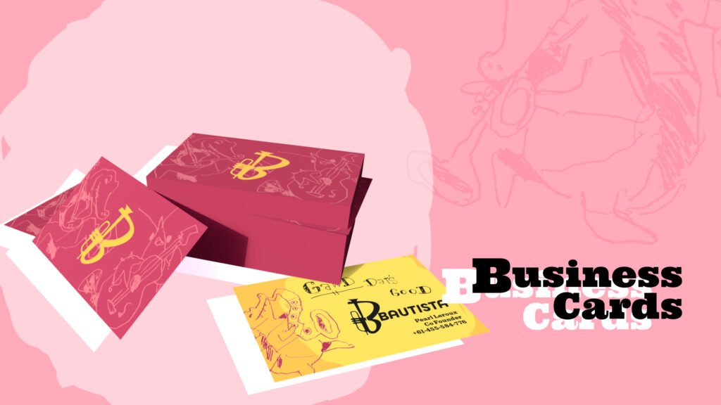
The goal of this project was to design a brand identity and touchpoints for a fictional restaurant. Bautista is a contemporary Creole/Cajun restaurant specialising in jazz music and late-night vibes.
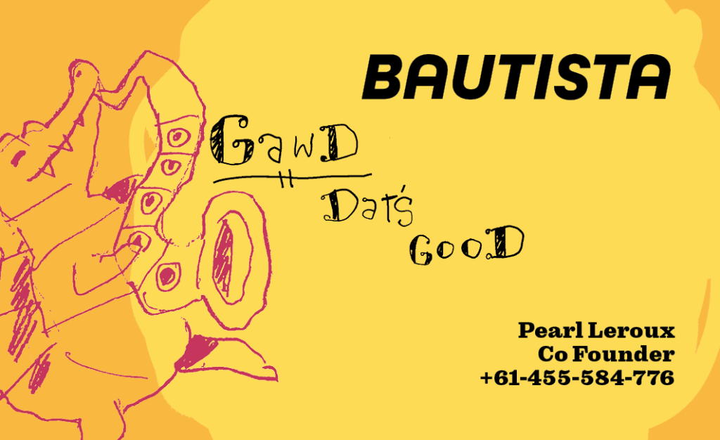
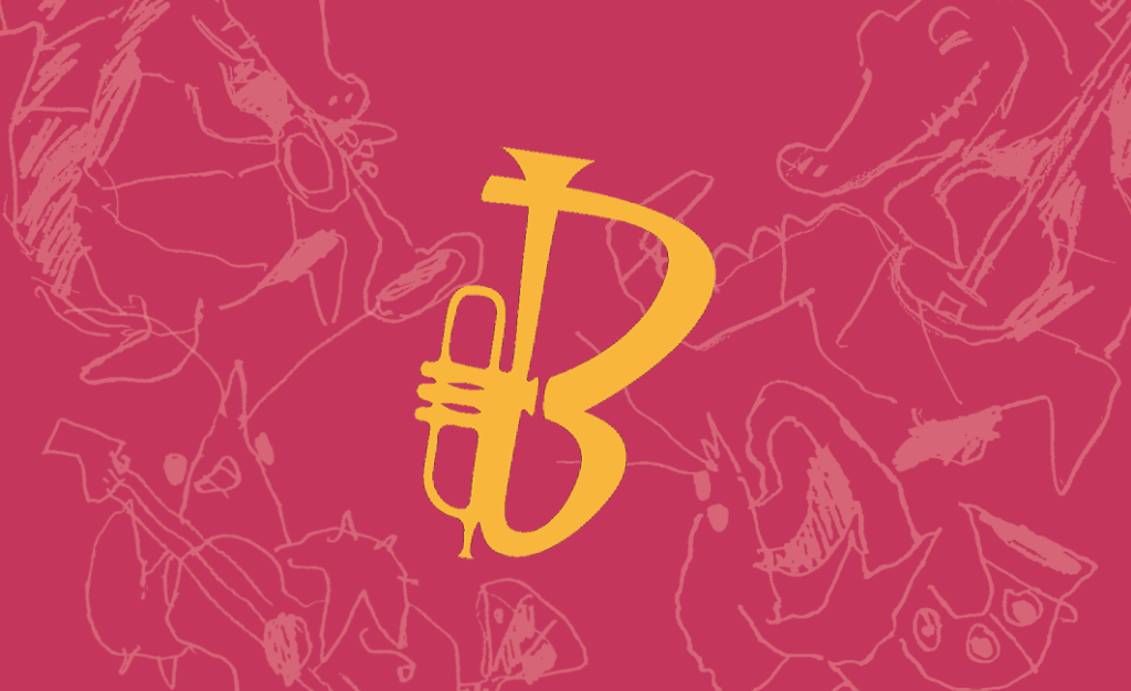
I was influenced by New Orleans Jazz for the brand design. I tried to reflect the experimental nature of the music through playful and chaotic visuals and an experimental use of text. I incorporated multiple display typefaces of varying weights and sizes inspired by the jumbled signs seen in the city’s French Quarter.
This project was a lot of fun to work on and gave me an opportunity to break out of the traditional grid structure and experiment with a more chaotic approach to design.
Business card (front)Business card (back)
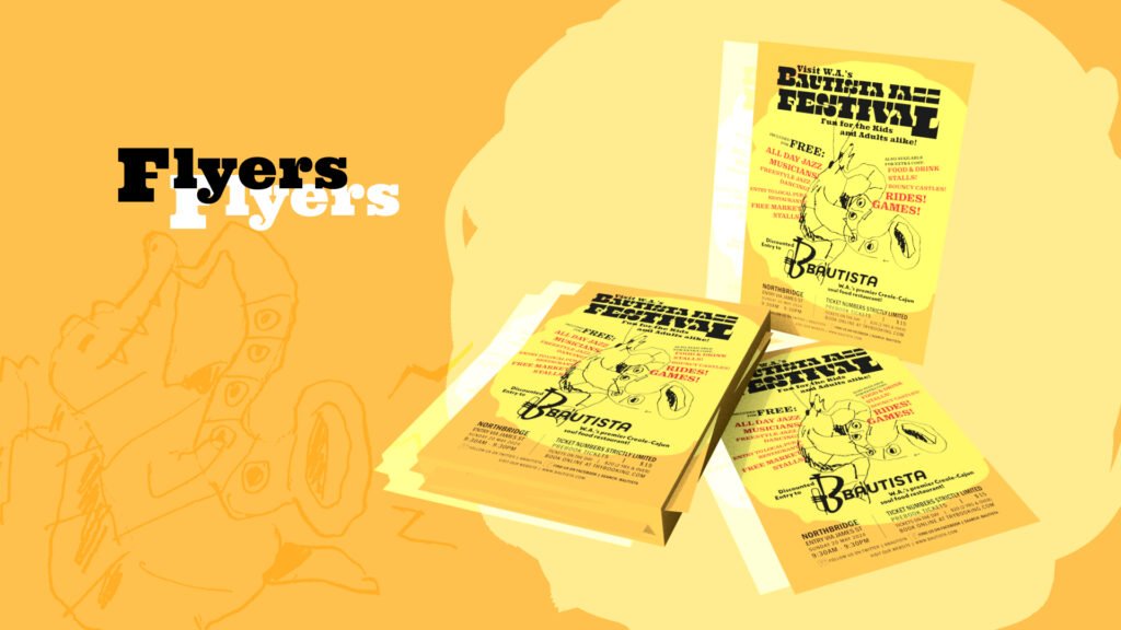
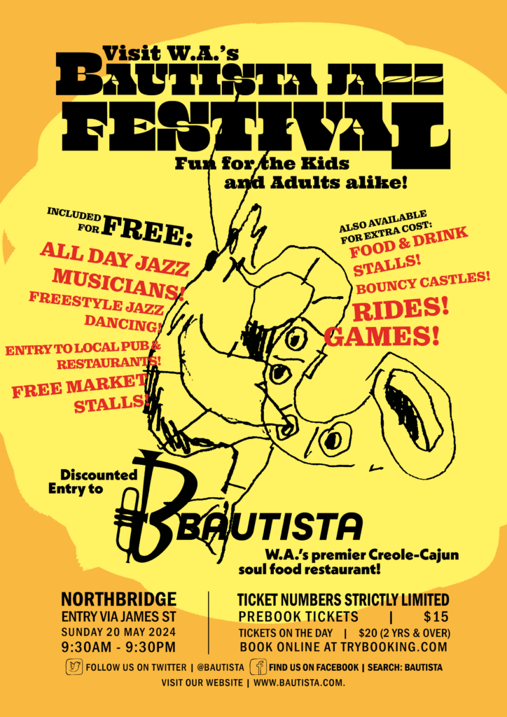
A flyer I created to advertise a fictional event using the restaurant’s branding.
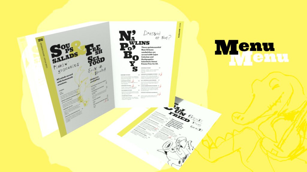
A menu I created for the restaurant using written content provided for the assignment.
Print is Not Dead: The Continuing Role of Print in the Thriller Genre is a publication that I worked on for a university assignment in 2025. The book explored the ways that graphic design and print are used in media to build suspense and thrill audiences.
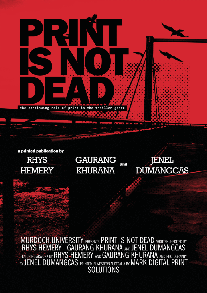
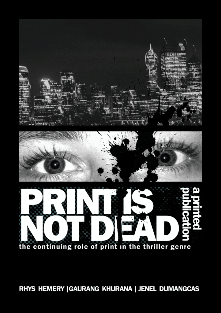
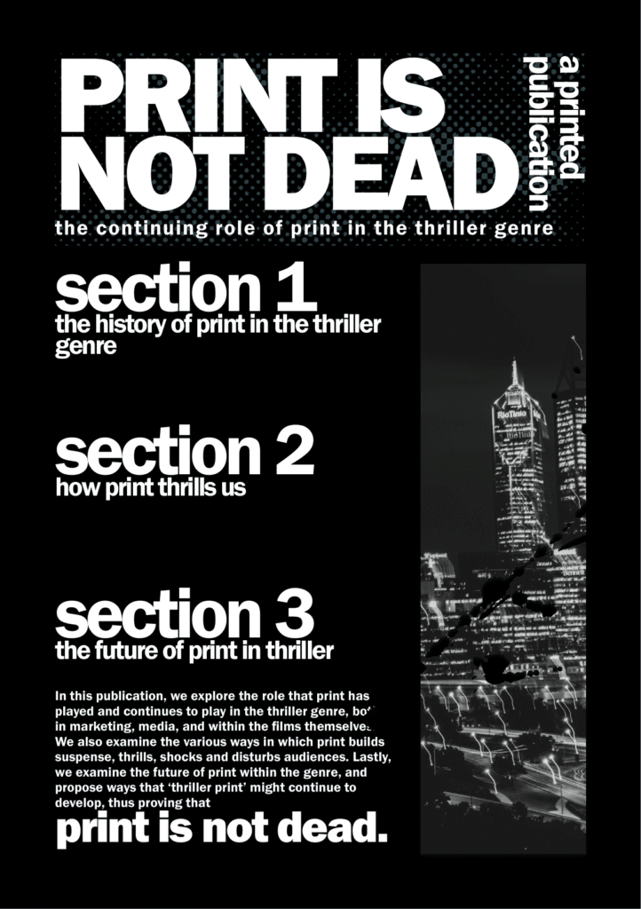
The visual design was inspired by thriller, crime and horror film posters. I experimented with using colour, texture and typography in unconventional ways to instill discomfort in the viewer. This meant harsh colours and lighting, overlapping and distorted textures and compressed, blocky letters. It was a fun style to work with, particularly as a fan of horror, thriller and film posters.
The full 40-page publication was a group project that I worked on with two other students, but the material shown here was created by me, incorporating photography by Jenel Dumangcas.
A3 posterA5 flyer (front)A5 flyer (back)
Bookmark (front)
Bookmark (back)
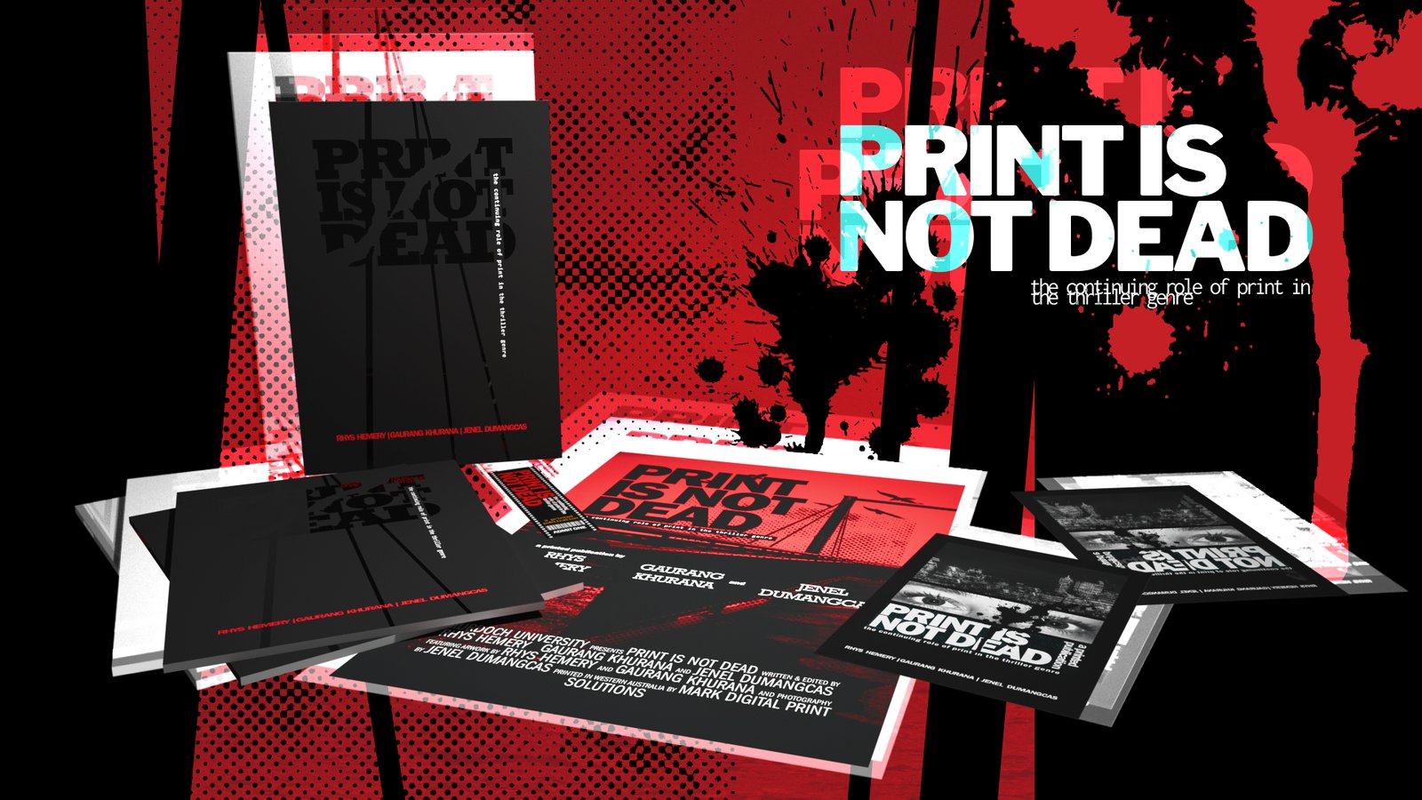
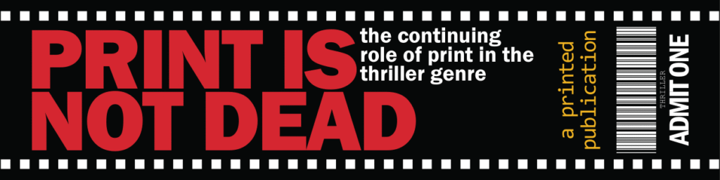
I designed several print-ready promotional touchpoints for the project to go along with the full publication (shown above).
The A3 poster is inspired by various film posters in the thriller and horror genres. Some notable inspirations include Silence of the Lambs (1991) , Dark Meridian (2017) and The Departed (2006). Our moodboards were filled with these posters, and I hope I managed to capture some of their unsettling energy in my designs. The poster and flyers feature lovely photography by Jenel, to which I applied heavy filtering to bring out areas of intense light and dark.
I designed each for a different colour printing model to familiarise myself with the different workflows. The poster uses CMYK, the flyer is greyscale, and the bookmark uses Pantone colours.
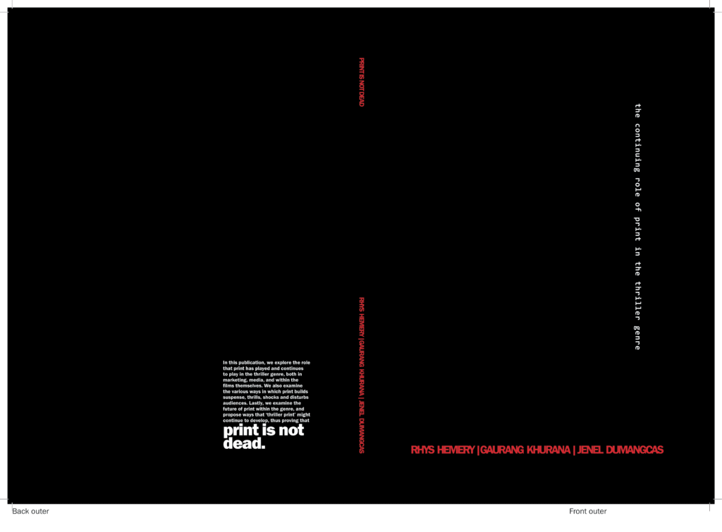
Outer cover
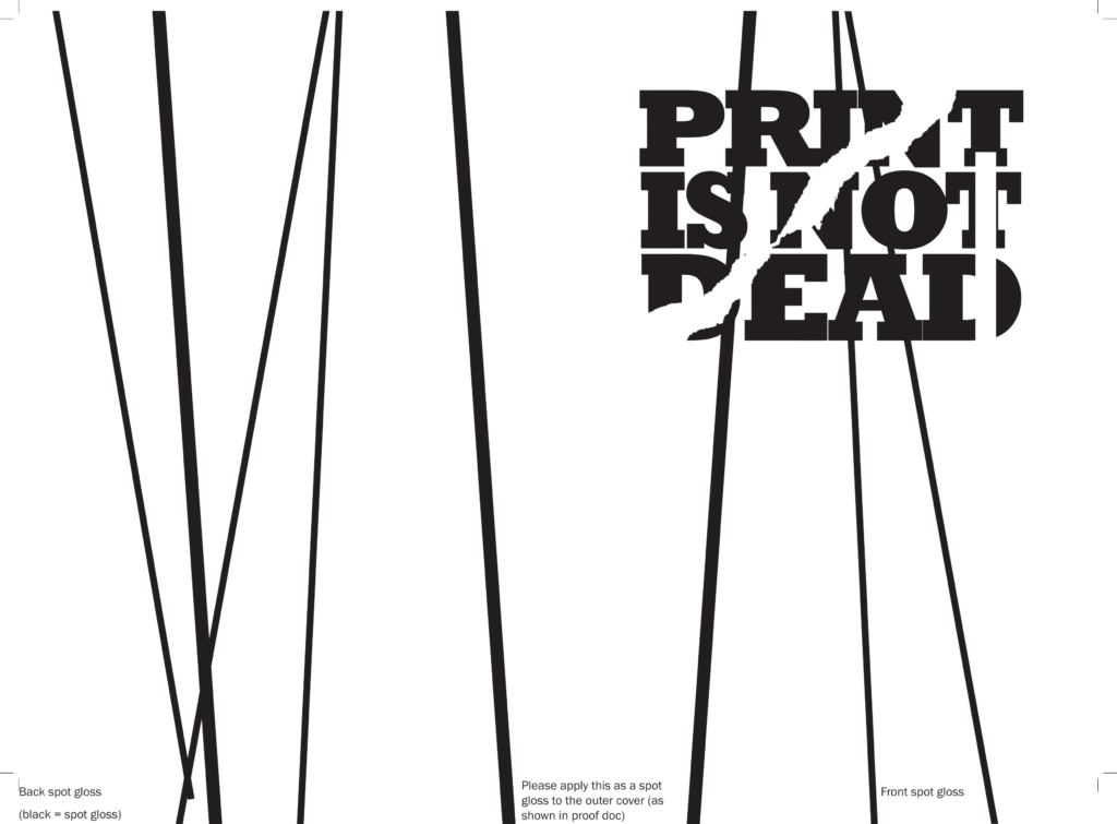
Outer cover (spot gloss)
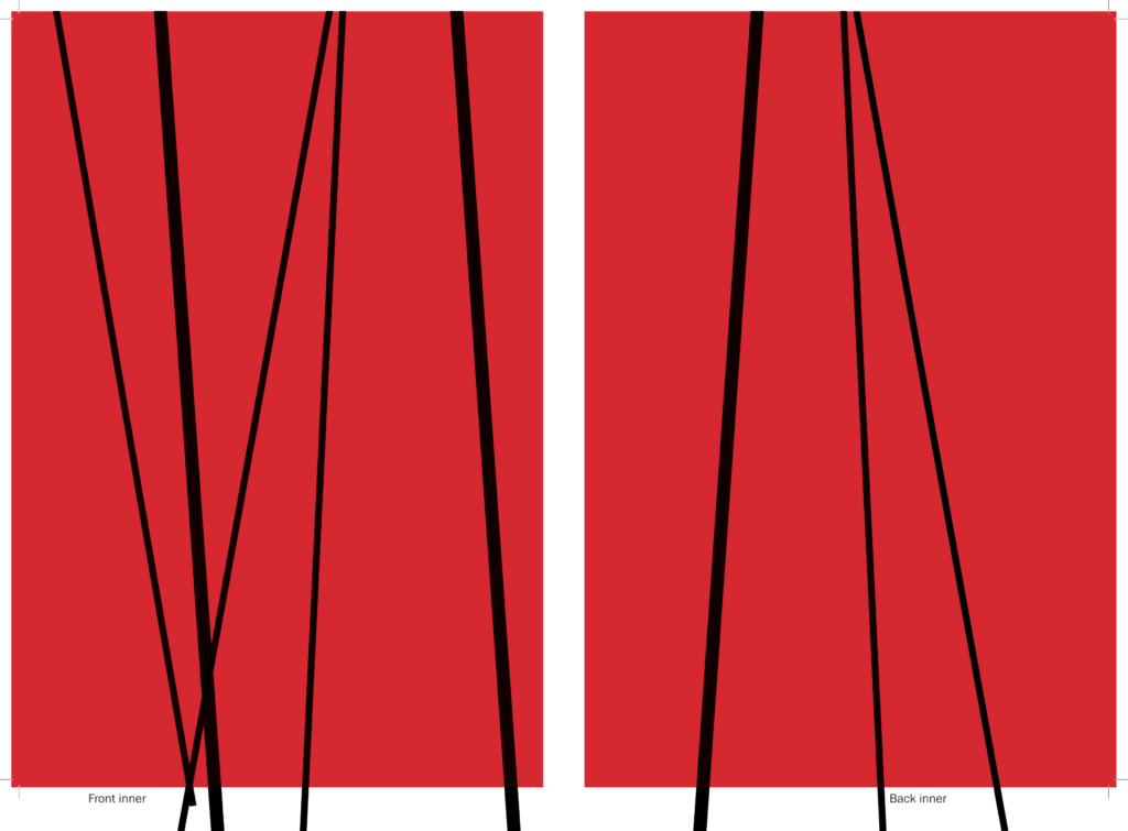
Inner cover
We had the idea of using a spot-gloss finish to make the publication’s cover a sort of secret message, only visible when the light reflects on it.
The created the cover using three print files (shown above): a black outer cover and red inner cover to be printed on satin coated stock, and a spot UV layer to be printed over the outer cover as spot gloss. The end result is clean, sleek and surprisingly legible, despite the title being written in clear gloss coating.