Tag: Branding

  • BAUTISTA

    BAUTISTA

    The goal of this project was to design a brand identity and touchpoints for a fictional restaurant. Bautista is a contemporary Creole/Cajun restaurant specialising in jazz music and late-night vibes.

    I was influenced by New Orleans Jazz for the brand design. I tried to reflect the experimental nature of the music through playful and chaotic visuals and an experimental use of text. I incorporated multiple display typefaces of varying weights and sizes inspired by the jumbled signs seen in the city’s French Quarter.

    This project was a lot of fun to work on and gave me an opportunity to break out of the traditional grid structure and experiment with a more chaotic approach to design.
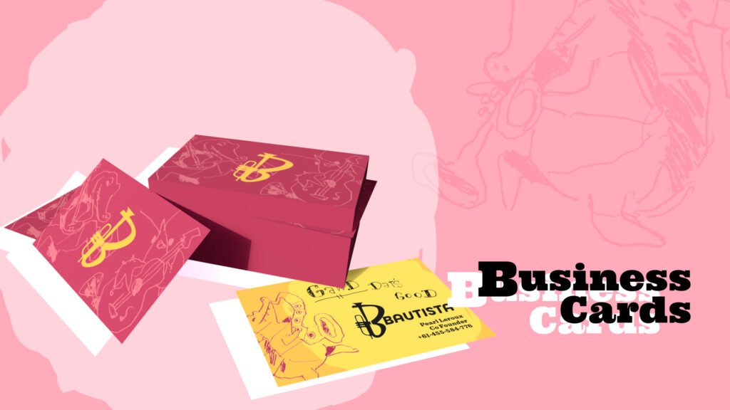
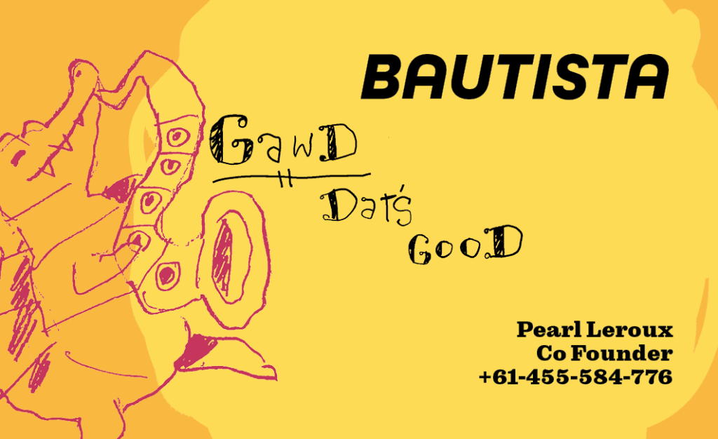
    A mockup 3D render of a pile of business cards.
    Business card (front)
    Business card (back)
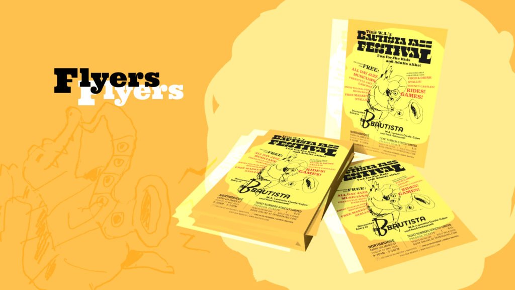
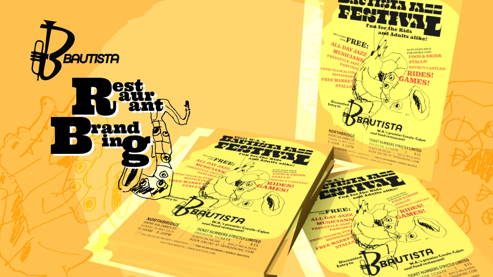
    A mockup 3D render of a pile of flyers advertising a Bautista music event.
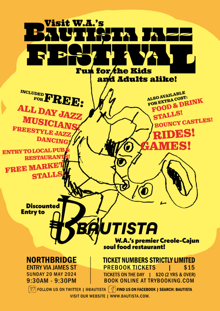
    A flyer I created to advertise a fictional event using the restaurant’s branding.
    A promotional flyer for a Bautista Jazz Festival. It features a crudely drawn shrimp playing saxophone against a yellow-orange background.
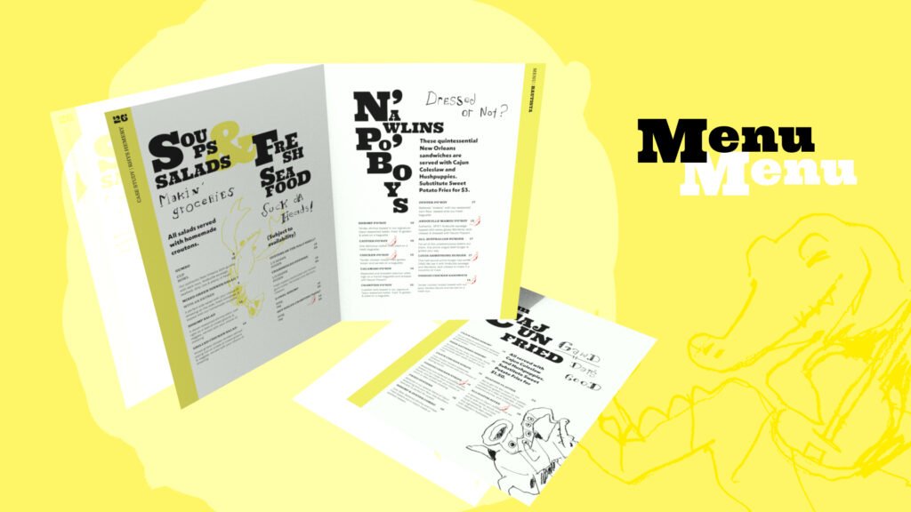
    A mockup 3D render of a pair of Bautista menus.
    A menu I created for the restaurant using written content provided for the assignment.
    A crudely drawn alligator playing trumpet
    A crudely drawn alligator playing saxophone
    A crudely drawn alligator playing a banjo
    Crudely drawn cocktail glasses clinking
    A crudely drawn bowl of jambalaya
    A crudely drawn sliced lemon
    A crudely drawn crawfish playing saxophone
    A crudely drawn crawfish playing bass
    A crudely drawn crawfish
    A crudely drawn crawfish
    A crudely drawn crawfish playing saxophone
    a crudely drawn saxophone

  • EVENTBLOOM

    EVENTBLOOM

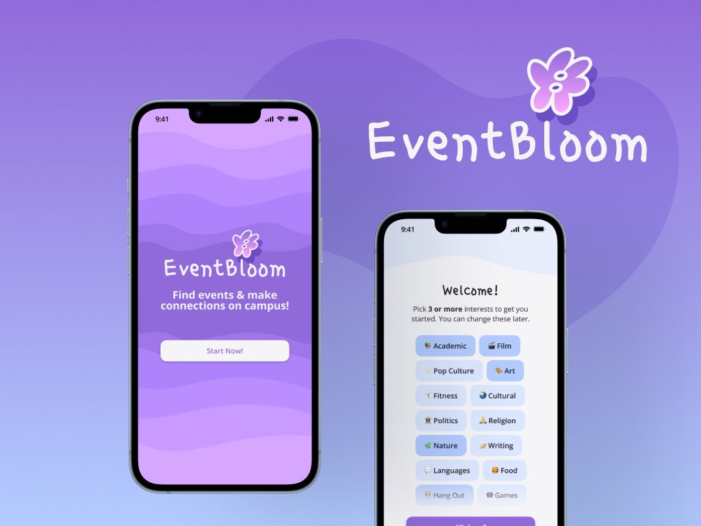
    EventBloom is a fictional app designed to help university students find events, join social groups and make connections. It is targetted towards new students and students who want to become more active in student culture. It provides a quick, easy way for users to find events that fit their interests and availability, with a focus on reducing stress for users going to an event for the first time.

    Digital Prototype

    This is a high-fidelity mockup of the app created in Figma. You can navigate using the mouse and scroll wheel as you would a phone’s touch screen. Take a look around!

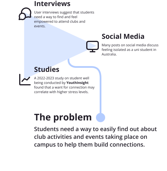
    A diagram showing the problem statement: Students need a way to easily find out about club activities and events taking place on campus to help them build connections.

    Why does it exist?

    I designed EventBloom for a university project in 2026. It is intended to help university students find activities and build connections on campus.

    I chose this goal based on interviews I conducted around campus, which suggest that more could be done to help and encourage students in finding relevant social events and groups. This is supported by scientific studies and posts on sites such as Reddit, which identify lack of connection as a widespread issue faced by Australian students.

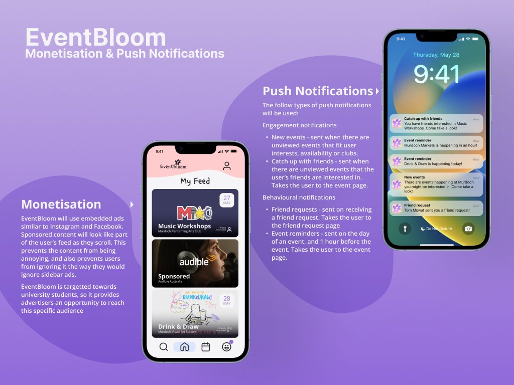
    A mockup displaying how the app handles monetisation and push-notifications.
    A mockup explaining how monetisation & push notifications would be handled in the app. I drew inspiration from social media apps like Facebook, and aimed to make the app simple, streamlined and unobtrusive.
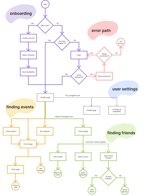
    A taskflow diagram detailing the various pages within the app, and the paths that a user would take to create an account/login, find events, find friends and adjust user settings. Paths are colour coded in pastel lilac, pink, yellow, violet and green.
    A taskflow diagram detailing the path a user would take when using the app.
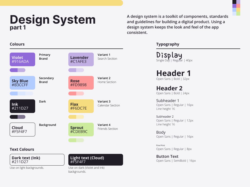
    A design system for the EventBloom app, detailing colours and typography.
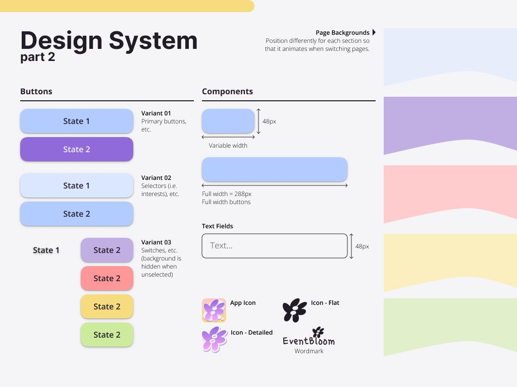
    A design system for the EventBloom app, detailing buttons, text fields, icons and motifs.
    The EventBloom flower logo in colour.
    The EventBloom app icon.
    The EventBloom flower logo in black.
  • DEXEL

    DEXEL

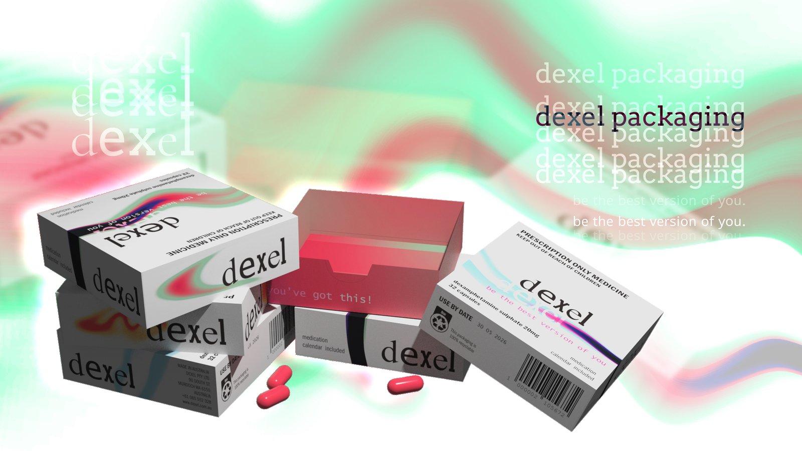
    Dexel is a hypothetical prescription dexamphetamine brand that I created for a packaging design project. My aim for this project was to design packaging that would give a more positive association to ADHD medication. Rather than presenting ADHD as something that needs to be fixed or suppressed through medication, I wanted to present the product as an aid that allows users to reach their full potential by focussing their minds.

    I found in my research that existing packaging is discreet and provides little information, suggesting that the medication is illicit or shameful and should be hidden. I wanted my packaging to be up-front about its purpose and effects, and to empower users to speak to their doctors if they are experiencing adverse effects.

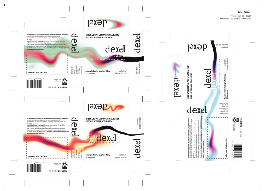
    Dielines for the outer packaging
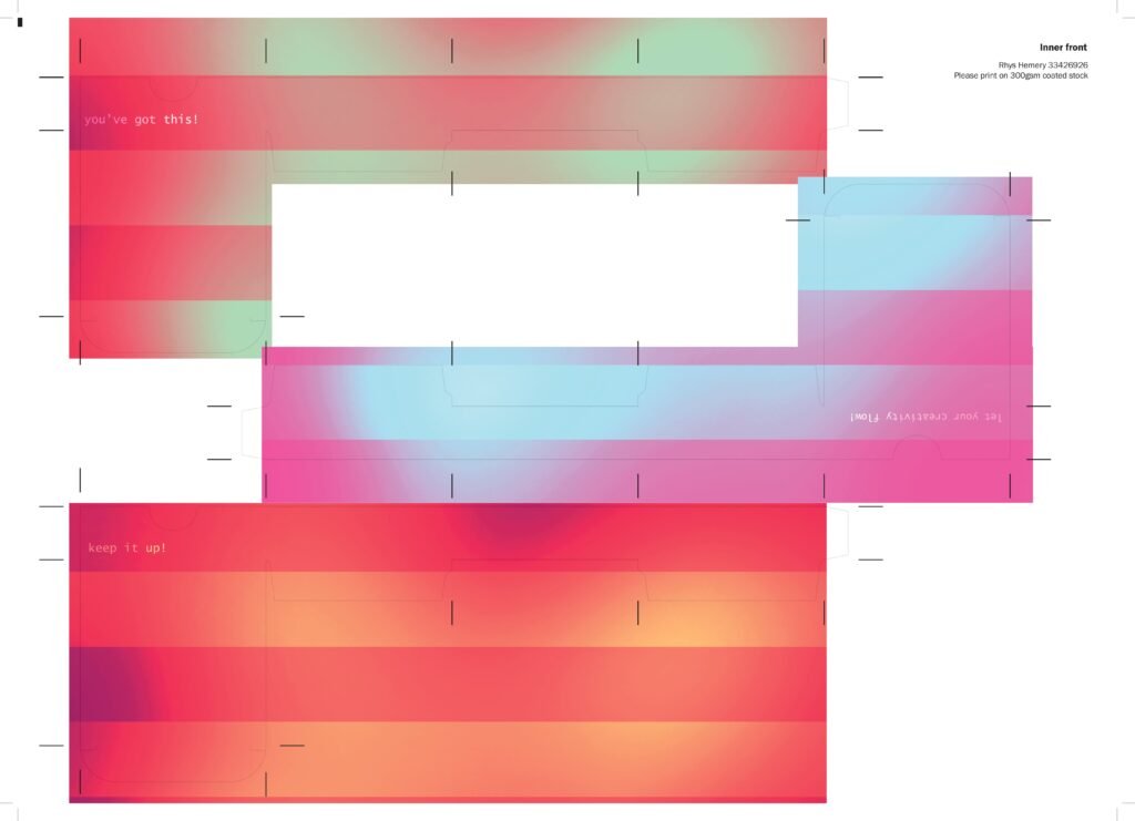
    Dielines for the inner packaging
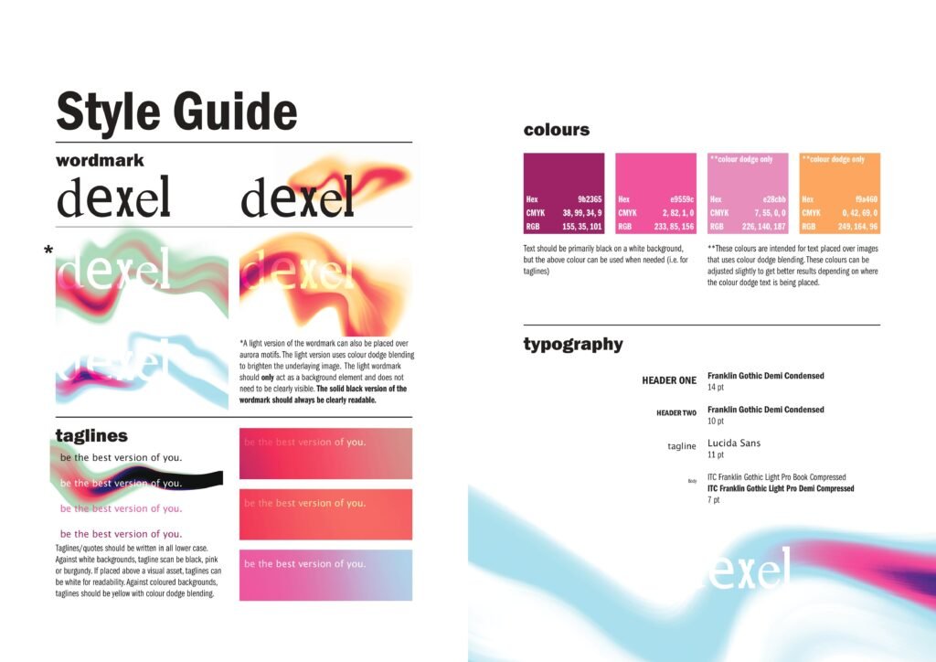
    Dexel style guide from the case study